The admin’s guide to reporting in Microsoft 365
Table of contents

Microsoft 365 reporting is designed to help you understand what’s happening in your business. They allow you to review user behaviors and identify areas for support or potential risks. What’s more, you gain crucial permissions visibility and transparency for governance purposes.
There are four key areas to get the most out of your Microsoft 365 reporting. Let’s get started!

Microsoft Office 365 reporting goals
You don’t have to worry about the garbage in, garbage out scenario regarding the data. However, you’ll need a goal-focused reporting plan with so many reports at your fingertips.
Start by defining the information you want to go in and the insights you want to get out. Consider questions such as:
- What Microsoft service do I need a report for?
For reports relating to Microsoft 365 services, you’ll need the Microsoft 365 admin center. For reports relating to activity in your environment, you’ll need the Azure Active Directory (AD). - What should be included in the report?
This depends on the audience for the report. Strategic overview for the CEO? Or in-depth granularity for developers? - What time period should be analyzed?
Microsoft 365 reports are available for the past 7, 30, 90, and 180 days. However, you’ll also need to consider compliance and regulations such as HIPAA, where some documents must be kept for at least six years. - What parts of the report need to be exported?
You can choose the columns to include or exclude in your reporting. Then it’s a simple click to download a CSV for further report analysis.

Microsoft 365 admin center reports
Reports in the Microsoft 365 admin center show usage levels within your organization. You can use this insight to keep your licensing allocation up-to-date and complete access reviews. Discover who’s reaching the maximum quota compared to who’s not using any services and may not require licenses.
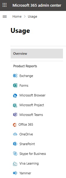
Types of reports available in the Microsoft 365 admin center
To access reports, click Reports > Usage, and then you’ll see the list of reports available:
Choose a specific day in the report to view up to 28 days of data. Data is generated after 24–48 hours.
Want to change the data that appears to only include what you need? No problem. Click Choose columns:
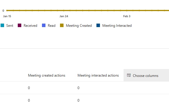
You can also filter the charts to only show the desired metrics. Tick the relevant color-coded box:
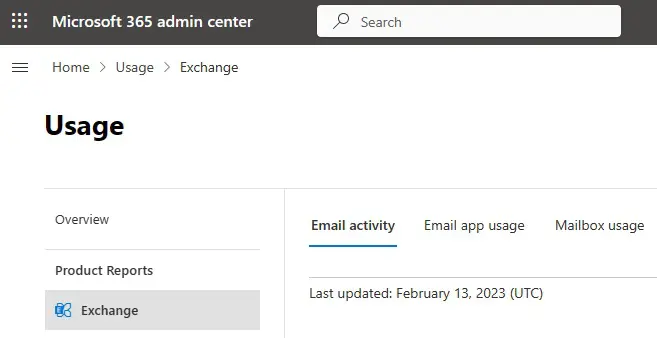
Exchange Online reporting
When you click Exchange, you’ll see three tabs: Email activity, email app usage, and mailbox usage. These give you insights into patterns of email traffic within your organization.
Email activity
Click this tab and you’ll find two charts waiting for you:
- Activity
Explore how email is being used in your organization. Find out how many emails are sent, received, and read. View how many meetings are created and interacted with.
- Users
View the unique users who are generating the email activity to see when they’re most or least active.
Email app usage
Click this tab for insights into how your products are being used in your organization. You can also drill down to analyze specific products.
Choose from:
- Users
How many unique users connected to Exchange Online are using any email app. - Apps
How many unique users are using each of your apps. - Versions
How many unique users are using each version of Outlook (if you see Undetermined, this means the chart can’t report the Outlook version).
Mailbox usage
This tab shows you what’s happening in each user’s mailbox. Find out activities around emails sent and read. View appointments created, with meeting sends, acceptances, declines, and cancellations.
You can view three charts covering the following:
- Mailbox
View the total number of mailboxes and how many are active. - Storage
View storage levels being used, and explore how this changes over time. - Quota
View where mailboxes are approaching or exceeding quotas. The reports include shared mailboxes.
Microsoft Teams reporting
Want reports on your organizational and user activities, collaboration, and communication? You’ll find it all in the Microsoft Teams reports.
Explore how users are messaging each other, from channel messages and chats to 1:1 calls and video sharing. You can also analyze meeting activity, including how many users have organized or participated. You can also go granular to explore information about external users, including interactions in externally shared channels.
Reports are available to global admins, global readers, and Teams service admins.
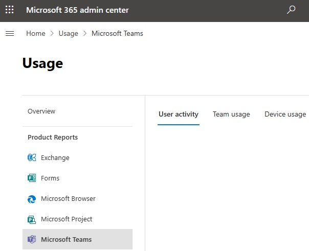
You can now view reports for:
- User activity
The first chart (Licensed activity) shows the types of licensed activities by licensed users. The second chart (Licensed users) shows the number of licensed users engaged in activities. - Team usage
This tab also shows two charts. The first is Channel usage. This shows the channels that are active, plus the active channels and channel messages. The Team usage chart shows the number of private and public teams, and the active teams. You can also drill down to analyze specific teams, with reports that include numbers of active guests. - Device usage
Clicking this tab reveals two charts. The Licensed users chart shows the devices used daily by users with licenses. The Distribution of licensed users chart helps you compare which devices have licenses. You can segment by Windows and Mac desktop clients, web client, Android phone, iOS mobile client, Chrome OS desktop client, and Linux desktop client.
Office 365 reporting
Here’s where you can view the users who have or haven’t activated an Office 365 subscription. Reports span desktops and devices.
You can view five reporting tabs:
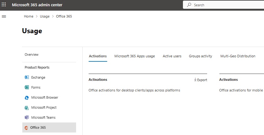
- Activations
View the number of activations across desktop and mobile apps. You can also compare the number of users who have been assigned product licenses to those who have activated their licenses. - Microsoft 365 Apps usage
View insights into how Microsoft 365 apps are being used in your organization. Reports are split by users, daily unique users, and platforms. - Active users
The Users chart shows the number of daily active users of Office 365 in your organization. The Activity chart shows the number of daily activities, while the Services chart shows the number of active and inactive users of each Office 365 service. - Groups activity
Reports show the number of total and active groups, with metrics for activity types, files, and storage for mailboxes and sites.
SharePoint reporting
Reports for SharePoint are divided into two tabs:
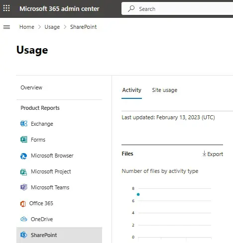
- Activity
One chart shows files that have been viewed, edited, synced, or shared internally and externally. The second chart shows the number of unique pages visited by users. - Site usage
Click this tab, and you will have four charts to analyze. View the number of total and active sites, total and active files, the amount of storage used, and the number of page views.
Yammer
You can find out how people in your organization are using Yammer to post, read, and like messages.
The reports are available under three tabs:
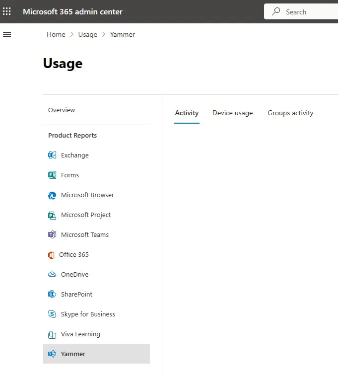
Under the Activity tab, you’ll find two reports:
- Activity
View how many posts have been made and compare the number to how many have been read or liked. - Users
View the number of users completing each type of activity (messages posted or liked, and conversations read).
Under the Device usage tab there are two reports:
- Users
Find out the devices that your users use for Yammer activity. - Distribution
This bar chart shows the number of users per device based on your chosen time period.
Under the Groups activity tab, you can explore how many Yammer groups are being created and used and the nature of the activity within the groups.
Reports allow you to view the total number of groups and compare these to the number of active groups.
Forms
You can analyze how users interact with forms, quizzes, and other survey types created in Microsoft Forms.
There are two activity charts:
- Users
View and compare activity between form designers, respondents, and total users. - Activity
View form-related activity, including forms created, signed-in responses, and anonymous responses.
Microsoft Browser
This report is useful for reporting usage and adoption of Microsoft Edge. You can find out how many use the browser for their online activities.
Data is based on an aggregate number of users signed in and using Edge to access Microsoft 365 services daily. The report displays two charts:
- Daily active users
How many use Edge for connecting to Microsoft 365 services. - Active users
How many use Edge to connect to Microsoft 365 services during a selected time period.
Microsoft Project
This report shows interactions with Microsoft Project by users with Microsoft Project licenses. View how many projects are visited and how many tasks are being created and edited.
There are four charts available:
- Active users
View active users per day. - Active users by client
View active users using Project for the Web and Project Online. - Project activity
View the number of daily sessions of Project for the Web and Project Online. - Task activity
View daily tasks created or edited in Project for the Web.
OneDrive
You can also find reports for analyzing OneDrive activity within your organization. Charts are found under two tabs:
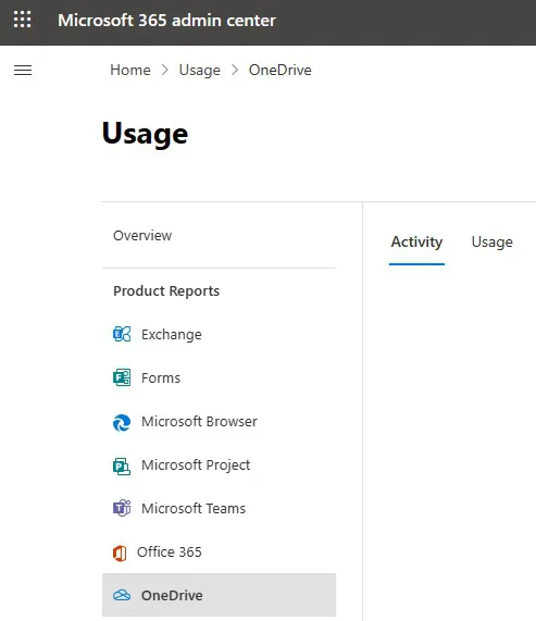
- Activity
You’ll find two charts: Files and Users. These display activity around files and user activity in OneDrive. View activity showing what and who has viewed or edited, synced, shared internally, and shared externally. - Usage
Clicking this tab shows three charts. These cover the number of total and active accounts, the number of total and active files, and the amount of storage used.
Skype for Business
Skype for Business may have been discontinued in 2021, but you can still view reports in Microsoft 365:
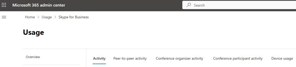
Five tabs give you data on:
- Activity
View how Skype for Business is being used by users, with options to view activities across multiple time periods. - Peer-to-peer activity
Analyze usage trends for sessions – the users, types, and activities such as file transfers, IM, audio, and video. - Conference organizer activity
Number of conferences organized by each user, plus the tech they’re using – such as IM, audio/video, applications, web, dial-in or dial-out. - Conference participant activity
Number of conferences attended by each user. - Device usage
Find out the details for installation and connection, such as what OS, mobile, or desktop.
Viva Learning
You can understand levels of Microsoft Viva adoption in your business. Reports cover:
- Active users
Explore how many people are interacting with Viva Learning each day. - User activities
Find out where users are spending time in Viva Learning platforms, including courses bookmarked, recommended, and consumed.

Azure AD reports
Here’s where you can understand what’s happening in your Microsoft environment.
View usage of apps and services, and find risks and vulnerabilities. You can also identify blockers and other issues affecting user productivity. You can download up to 250,000 records, in CSV or JSON format.
These two reports tell you what you need to know:
Audit logs
View every logged event, activity, and task performed in your tenant. This includes changes to applications, groups, users, and licenses. Available filters include:
- Service
View all or choose specific service reports. - Category
These include changing policies or activating services. - Activity
The data automatically changes based on the categories you choose. - Status
Organize reports based on successes or failures. - Target
View activity targets and recipients with searches by name or User Principal Name (UPN). - Initiated by
Search (name or UPN) who initiated an activity.
Reports are available for every feature where you have a license. They’re categorized by user, group, and application management.
Roles with access to the audit logs:
- Global Administrator
- Global Reader
- Reports Reader
- Security Administrator
- Security Reader
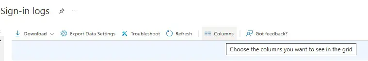
Sign-ins
This report helps you understand how users access services and applications. View sign-in patterns, statuses, and any authentication errors.
- Open the Azure portal.
- Select Azure Active Directory > Sign-in logs.
- There are 30+ column options, so click Columns to customize your preferred view and avoid column overload:
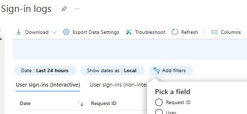
4. Select Add filters to go granular with your reporting:
Microsoft 365 reporting automation
As you can see, there are many reporting options available. If you’re wondering how you’ll ever find time to run these, don’t worry – we’ve got you covered.
You can automate some reports for Teams, Outlook, SharePoint, Yammer, and general Microsoft 365 activity. Automation is done using a mixture of Microsoft Power Automate and Microsoft Graph:
- Open Azure AD.
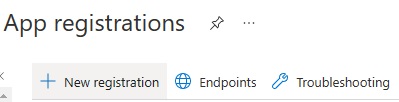
- Click App registrations.
- Click New registration.
- Select who can use the report.
- Click Register.
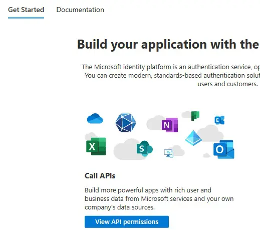
- Click View API permissions:
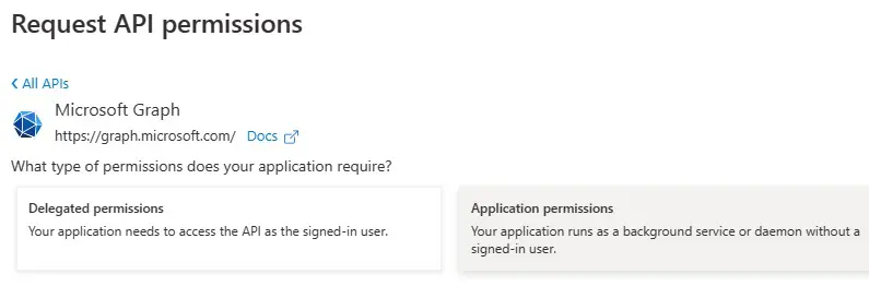
7. Click Add a permission > Microsoft Graph > Application permissions:
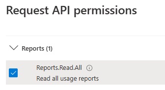
8. Click Reports and tick Reports.Read.All:
- Click Certificates & secrets in the sidebar.
- Create a client secret and copy the value.
- Open Microsoft Power Automate.
- Click Create > Instant flow.
- Select When an HTTP request is received as the flow trigger.
- Click Create.
- Click the block and click Use sample payload to generate schema.
- Use PowerShell to generate a sample JSON message and paste the copied schema (from Step 10).
- Click Save.
- Click New Step, add Initialize variable with:
Name: application_id
Type: string
Value: AAD App – Application (Client) Id - Click New Step, add Initialize variable with:
Name: directory_id
Type: string
Value: AAD App – Application (Tenant) Id - Click New Step, add Initialize variable with:
Name: secret
Type: string
Value: AAD App secret - Click New Step, add HTTP with:
Name: application_id
Type: string
Value: AAD App – Application (Client) Id - Now test the flow in Microsoft Graph Explorer.
- The output should appear in JSON format, under the HTTP block.
Syskit Point – reporting made easy
We hope this guide will help you with reports in Office 365. But if you want to improve your reporting even more and stop wondering about the state of your environment, learn more about Syskit Point’s reporting capabilities.